This webpage describes the basic guidelines we can follow to ensure consistency for the Ezell Consulting brand in the real world—both online and offline. All of the necessary files for digital and print applications are labeled and linked for download right from this webpage.
This site is designed to work best in Google Chrome. If you're using Safari or Internet Explorer and want to download logos, you'll have to right-click then select "Save image as...", otherwise just click the button!
Your logo is the mark that represents your business on all client-facing materials.
We want Ezell Consulting to come to mind when educators think of a better and more compassionate education system. A consistent presentation of your brand is crucial to maintain this awareness. The logo acts as the heart of your brand—a visually strong mark that represents the core of Ezell Consulting’s values and culture.
The full logo has three main parts:
The mark is a tilted lowercase “e” circumscribed by a lowercase “c.” The Bullseye embodies the strength of the Ezell name and emphasizes the three e-words in the tagline—empathy, excellence, and education. The target-like logo reinforces Ezell Consulting’s ability to advocate for excellent and equal schooling for all.
Ezell Consulting, styled in Proxima Nova Semibold.
Empathy and Excellence in Education, styled in Proxima Nova Semibold, underneath the business name and logo.

The logo allows for multiple arrangements. Note the proper arrangement and proportions of each configuration—kindly allow for breathing room and refrain from deviation.
Full Logo
All three parts used together: Bullseye + Business Name + Tagline. Use the full logo when the context requires all of the information. Good use cases include: the website, business cards, and email newsletters, flyers, and pamphlets.
Full + Business Name
Simply remove The Descriptor when the context already provides that information. Good use cases include: letterhead, stationery, sponsorship placement.
Bullseye (Square)
The logomark is unique, recognizable, and strong. In certain contexts, it can be displayed alone. Good use cases include places where that information will be redundant: social media profile pictures, website favicon (that little icon up in the tab), on the back of business cards, and on merchandise. This is especially useful in cases where the reproduced image is too small for text to be legible.
In certain contexts, the logo may be used with alternate colors, inverted colors, or in grayscale (black & white). For example, a maroon t-shirt with your logo in white. Another use could be the Bullseye with inverted colors as a social media profile picture. Perhaps you’re sponsoring an event and posters are printed with sponsor logos in black and white—now you’re equipped to handle all situations.
Abide by these simple guidelines to ensure your logo represents your brand effectively across all client-facing materials.
Along with the arrangement of the logo, the consistent color choices will help increase recognizability of your brand. Navy and Slate Gray function as the primary colors, with Light Grey function as the primary background and supporting color. These reinforce the professionalism of your brand. For accent colors, we use a light blue to match the logo. For text and some accents, we use a near black color.
A note on color usage: We emphasize "using less color to make it more colorful," a design principle which implements a primary color economically.
Official color codes are listed with each color.
Blue
Hex #74aad6
RGB: 116, 170, 214
CMYK: 54, 22, 3, 0
Slate Grey
Hex #525252
RGB: 82, 82, 82
CMYK: 64, 57, 56, 33
Light Grey
Hex #969696
RGB: 150, 150, 150
CMYK: 44, 36, 36, 1
White
Hex #FFFFFF
RGB: 255, 255, 255
CMYK: 0, 0, 0, 0
The primary typeface is Proxima Nova.
A modern, geometric, sans-serif (that’s just a fancy way of saying it’s a clean, minimal typeface). Picked for its legibility and attractiveness at heavy weights, as demonstrated by the logo, Proxima Nova is great for:
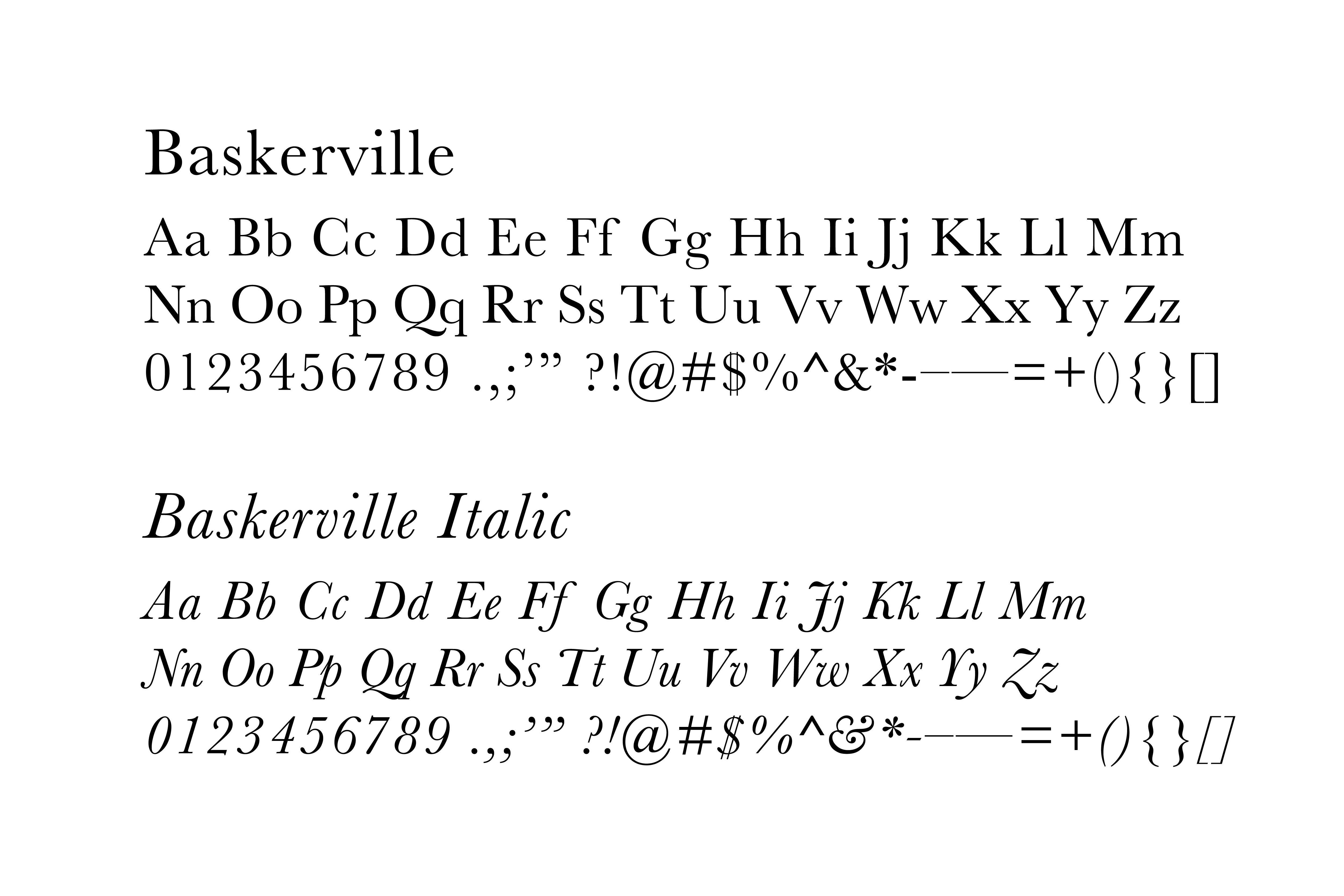
The secondary typeface is Baskerville.
This is a classic and trusting (literally, studies have shown that people are more apt to trust information displayed in Baskerville) font that makes for great body copy. The serifs (little tails on each letter) and stroke contrast make longer articles easy reading both on screens and in print. Use for:
4.0 Social Media
We believe simplicity on social media profiles works best.
For profile images:
Most channels (facebook, twitter, instagram) use square or circular profile images—for those sites the Ezell_bullseye or Ezell_bullseye_dark work perfectly. Trying to cram your entire logo into those small avatars usually results in an unreadable blur.
Download Me!
For banner or header images:
Some channels (i.e. facebook and twitter) offer banner images above your profile. These have distinct dimensions that we can utilize for unique announcements to parents and the community, for example: announcing summer break, reminders for registration deadlines, and advertising special events.
Download Me!