This webpage describes the basic guidelines we can follow to ensure consistency for the Thrive Institute for Neuropathy & Functional Medicine brand in the real world—both online and offline. All of the necessary files for digital and print applications are labeled and linked for download right from this webpage.
Last Update:
This site is designed to work best in Google Chrome. If you're using Safari or Internet Explorer and want to download logos, you'll have to right-click then select "Save image as...", otherwise just click the button!
Your logo is the mark that represents your business on all client-facing materials.
We want Thrive Institute for Neuropathy & Functional Medicine to come to mind when people within your demographic seeks relief from chronic pain or discomfort that has gone untreated by traditional medical approaches and physical therapy practice. We want the brand to remain strong so that your patients can easily recall and refer friends to your business. A consistent presentation of your brand is crucial to maintain this awareness. The logo acts as the heart of your brand—a visually strong mark that represents the core of Thrive’s values and culture.
The full logo has three main parts:
We refer to this as The Waveform; a rectangular shape consisting of 6 horizontal bars, which progress from straight at the top, to a wave at the bottom. This shape is an abstraction of the Six Pillars of Functional Medicine, with each horizontal bar representing one pillar. The subtle progression of rippled to flat bars representing Functional Medicine’s holistic approach to health and a return to vitality.
Thrive, styled in All-Caps Proxima Nova Semibold.
Neuropathy & Functional Medicine, styled in styled in Title Case (first letter capitalized) Proxima Nova Semibold.
The logo allows for multiple arrangements. Note the proper arrangement and proportions of each configuration—kindly allow for breathing room and refrain from deviation.
Full Logo
All three of the parts used together (Waveform, Business Name, and Descriptor). Use the full logo when the context requires all of the information. Good use cases include: website, business cards, email newsletters, flyers, and pamphlets.
Logo + Business Name
Simply remove The Descriptor when the context already provides that information. Good use cases include: letterhead and stationery.
Waveform Logomark (square)
The logomark is unique, recognizable, and strong. In certain contexts, it can be displayed alone (i.e. without the Business name or Descriptor). Good use cases include places where that information will be redundant: social media profile pictures, website favicon (that little icon up in the tab), on the back of business cards, and on merchandise. This is especially useful in cases where the image is too small for text to be legible; yet the logo is recognizable.
In certain contexts, the logo may be used with alternate colors, inverted colors, or in grayscale (black & white). For example, the back of your business card has the full logo displayed with the inverted color palette (white logo on a burnt orange background). Another use could be the Waveform with inverted colors as a social media profile picture. Perhaps you’re sponsoring an event and they are printing materials with sponsor logos in black and white—now you’re equipped to handle that situation too.
Abide by these simple guidelines to ensure your logo represents your brand effectively across all client-facing materials.
Along with the arrangement of the logo, the consistent color choices will help increase recognizability of your brand. Burnt Orange functions as the primary color to in order to suggest strength and vitality, while adopting a more unique palette that will set Thrive apart from the traditional healthcare palette of blue and green. To complement the primary color, we’ve selected a palette to match the interior paint color of your office. Official color codes are listed with each color.
A note on color usage: We emphasize "using less color to make it more colorful," a design principle which implements a primary color economically.
Official color codes are listed with each color.
Burnt Orange
Hex #CD8B3F
RGB: 205, 139, 63
CMYK: 18, 48, 88, 2
Great Grey
Hex #CABFB2
RGB: 202, 191, 178
CMYK: 21, 21, 28, 0
Thunderbolt
Hex #7D8681
RGB: 125, 134, 129
CMYK: 53, 49, 45, 7
Winter Feather
Hex #7E756B
RGB: 126, 117, 107
CMYK: 50, 47, 54, 14
The primary typeface is Proxima Nova.
A modern, geometric, sans-serif (that’s just a fancy way of saying it’s a clean, minimal typeface). Picked for its legibility and attractiveness at heavy weights, as demonstrated by the logo, Proxima Nova is great for:
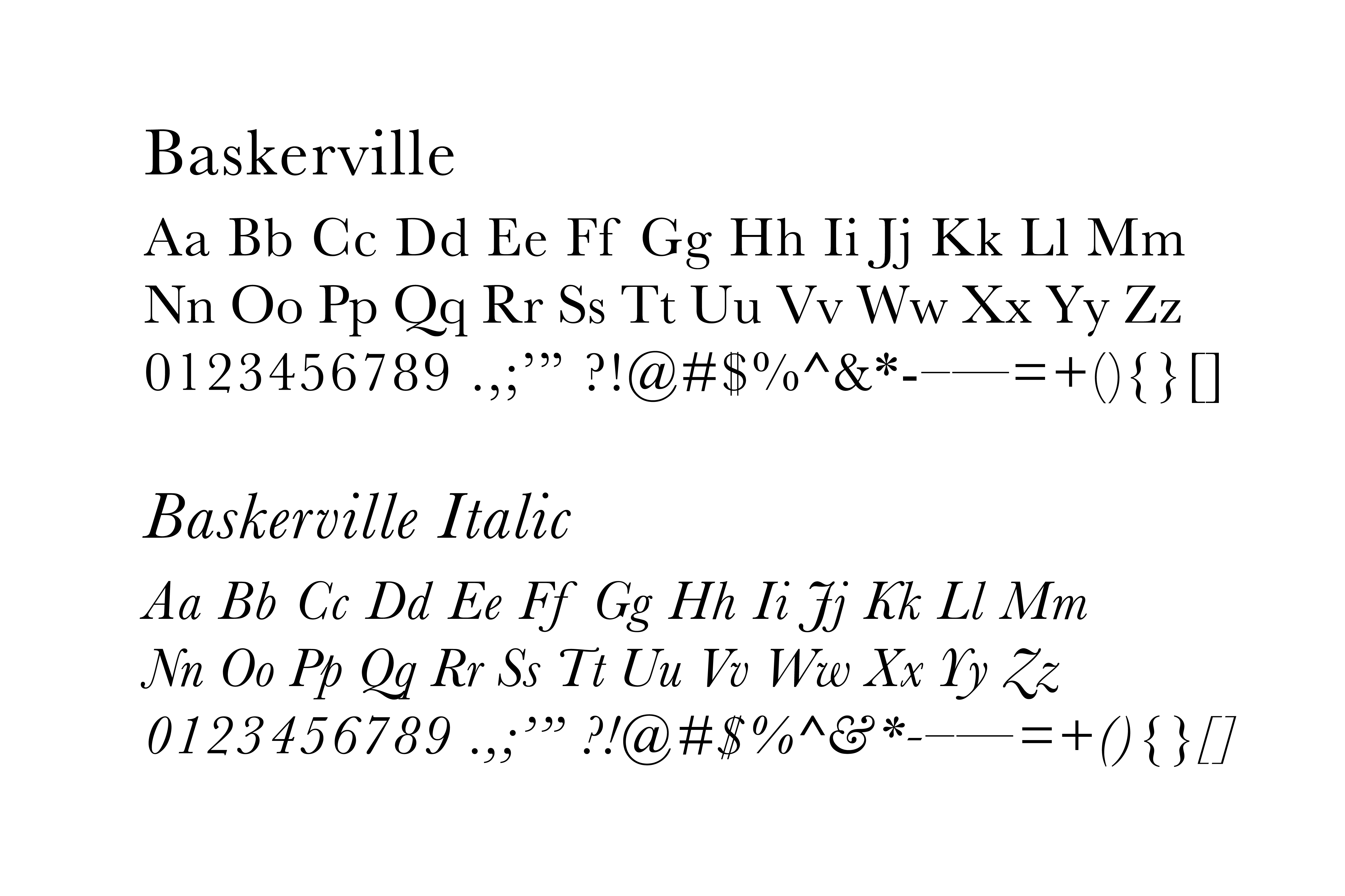
The secondary typeface is Baskerville.
This is a classic and trusting (literally, studies have shown that people are more apt to trust information displayed in Baskerville) font that makes for great body copy. The serifs (little tails on each letter) and stroke contrast make longer articles easy reading both on screens and in print. Use for:
4.0 Social Media
We believe simplicity on social media profiles works best.
For profile images:
Most channels (facebook, twitter, instagram) use square or circular profile images—for those sites the thrive-logo_waveform.png or thrive-logo_waveform_inverse.png work perfectly. Trying to cram your entire logo into those small avatars usually results in an unreadable blur.
Download Me!
For banner or header images:
Some channels (i.e. facebook and twitter) offer banner images above your profile. These have distinct dimensions that we can utilize for unique announcements to parents and the community, for example: announcing summer break, reminders for registration deadlines, and advertising special events.
Download Me!